Company tagline
Independent risk infrastructure for on-chain capital.
Hero headlines, pitch decks, About, email signatures.
Brand
Official Philidor voice, copy, logos, colors, typography, and patterns. Use approved messaging and these assets when referencing Philidor in press, integrations, events, or co-marketing.
Canonical tagline, slogan, and positioning, plus tone rules for marketing, social, and product copy.
Company tagline
Independent risk infrastructure for on-chain capital.
Hero headlines, pitch decks, About, email signatures.
Short slogan
Score risk. Deploy capital.
Banners, ads, CTAs, social hooks, event slides.
Long positioning
Philidor scores, monitors, and governs on-chain capital through independent risk models, custom baskets, and open methodology, with risk dashboards, APIs, and advisory for institutional allocators.
Meta descriptions, partnership intros, MCP/API listings.
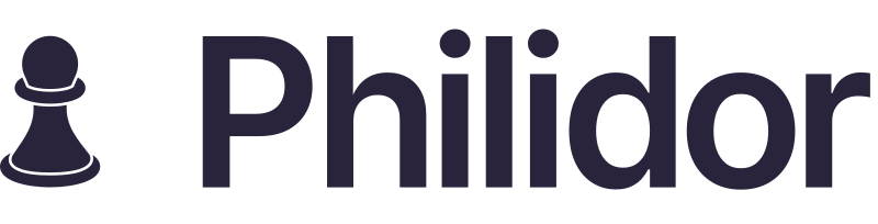
The chess pawn mark and lockup are the primary brand identifiers. Leave reasonable margin around the logo so it stays clearly visible. Never place it on busy photography without a solid backing.


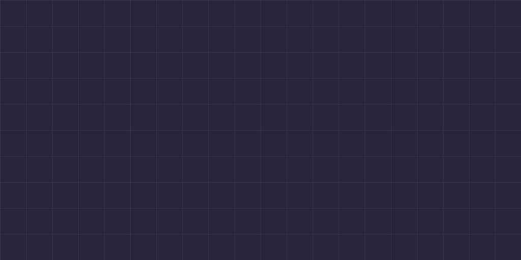
Philidor uses a restrained palette: deep brand primary, light surfaces, and violet accent for interaction. Prefer primary colors for most UI; use secondary tokens for hover, borders, and diagrams.
#29233C
rgb(41, 35, 60)
cmyk(32, 42, 0, 76)
Headlines, dark sections, primary text on light backgrounds.
#FAFAFA
rgb(250, 250, 250)
cmyk(0, 0, 0, 2)
Page background, cards on light mode, reversed text on dark surfaces.
#7C3AED
rgb(124, 58, 237)
cmyk(48, 76, 0, 7)
CTAs, links, focus rings, highlights, and interactive emphasis.
#5B507A
rgb(91, 80, 122)
cmyk(25, 34, 0, 52)
Gradients, secondary emphasis, and depth on dark hero sections.
#8B5CF6
rgb(139, 92, 246)
cmyk(43, 63, 0, 4)
Hover states for buttons and links.
#6D28D9
rgb(109, 40, 217)
cmyk(50, 82, 0, 15)
Pressed / active states.
#FFFFFF
rgb(255, 255, 255)
cmyk(0, 0, 0, 0)
Cards, dropdowns, and elevated panels on light mode.
#F4F4F7
rgb(244, 244, 247)
cmyk(1, 1, 0, 3)
Subtle section backgrounds and table stripes.
#29233C1F
rgb(41, 35, 60 / 12%)
n/a
Dividers and component outlines on light surfaces. Base #29233C at 12% opacity.
#29233C61
rgb(41, 35, 60 / 38%)
n/a
Diagram lines and decorative grid patterns. Base #29233C at 38% opacity.
Grid and gradient patterns support hero sections and event collateral. Keep opacity subtle so content remains readable.
Inter is the sole type family across philidor.io and product apps, from marketing headlines to dashboard UI.
Display · 600 · 36-48px
Inter
Headline · 600 · 28px
Independent risk infrastructure for on-chain capital.
Body · 400 · 16px
Deterministic vault scoring across 800+ markets on philidor.io.
Body medium · 500 · 15px
Powered by Philidor · api.philidor.io
UI label · 500 · 13px
Risk score · Prime tier · 8.4/10
Caption · 400 · 12px
Data provided for informational purposes only.
Monospace data uses JetBrains Mono in analytics tooling only.
Get Inter on Google Fonts →By downloading these assets you agree to use Philidor trademarks in line with our Terms of Service.
For press or partnership requests, email contact@philidor.io.